
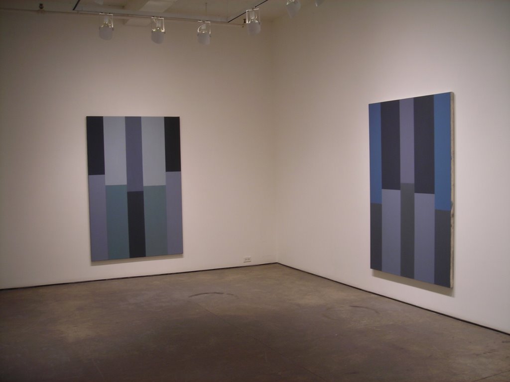
Pat Lipsky: Color Paintings
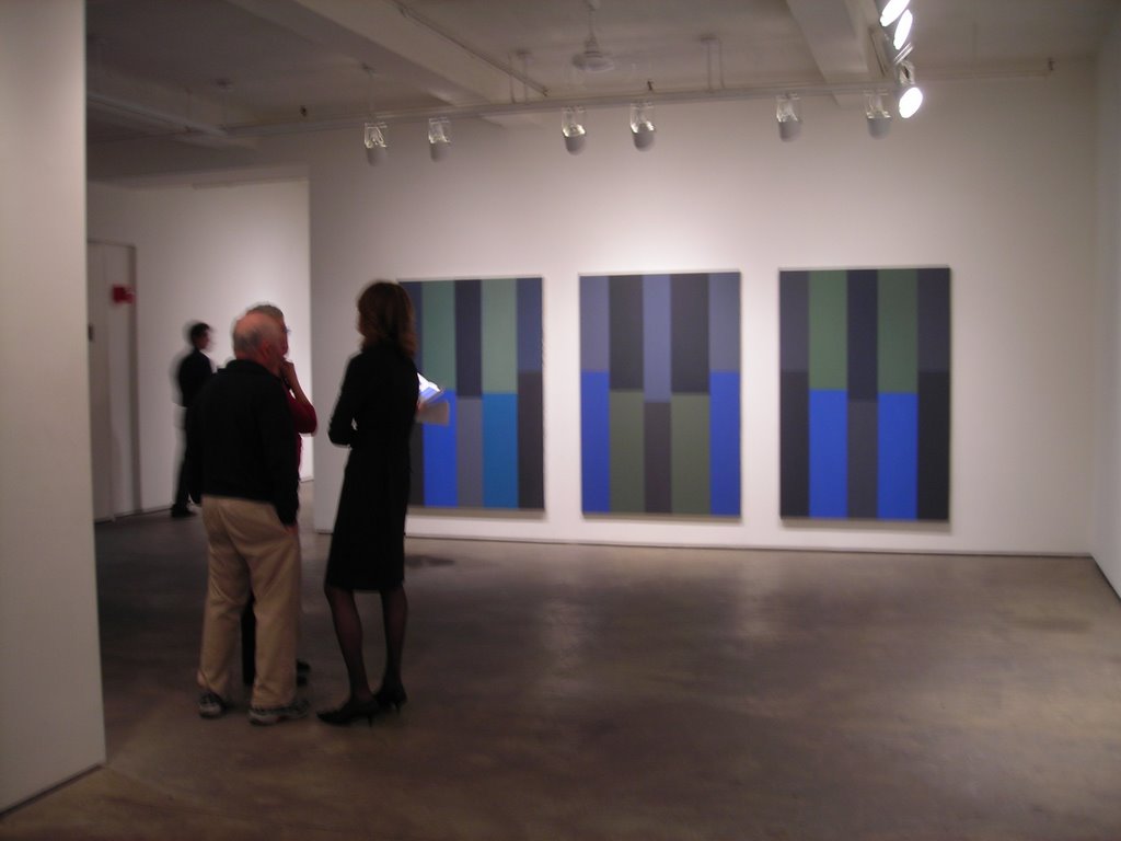
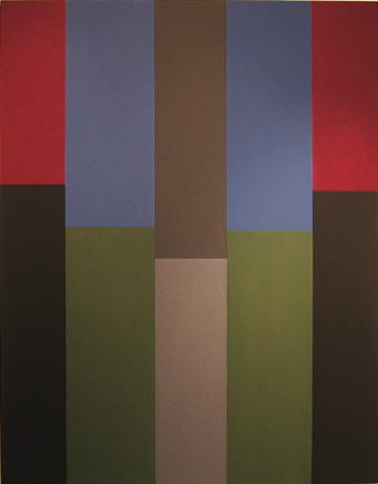
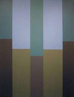
 I was able to see Lipsky's show in the fall of 2004 and have been looking forward to the next since in the last she didn't wow me. In the 2004 show Lipsky arrives at her current composition, a very unique way of breaking up the canvas with five vertical rectangles both on top and bottom and having them meet half way. Red River Valley: 9 Paintings focused on the use of Red, Blue, Black, and Grey. Not too interesting since Ms. Lipsky is a masterful colorist. When going into the recent show I already knew what to expect since I had taken a peek at the show online. I saw that her color had changed dramatically and that her compositions remained the same as the Red River Valley paintings but because of the new color modulations it did not get boring. The new compositions now look more direct and clear.
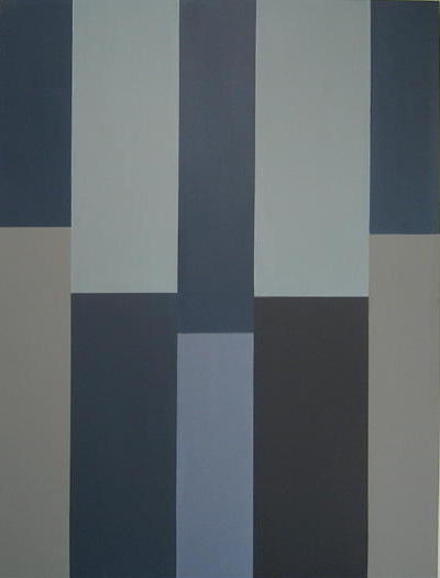
Mandible, 2005, oil on canvas, 82 x 62 1/2 inches
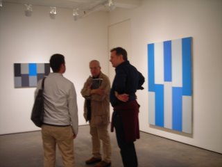
At first glance Lipsky's paintings come across as minimal and technically speaking, easy. Upon closer inspection the paintings come alive and a sense of movement/rhythm starts to happen. This rhythm is not accidental, it is calculated since Lipsky firmly believes in Hans Hofmann's idea of "push and pull," an idea very evident in her work with bands of color meeting at different points. The horizon line gets broken up and bars start to push up and down. A student of hers once said that the movement of Lipsky's work reminded her of the equalizer lights of a sound system going up and down. This is a very good point made by her since another idea deeply rooted in Lipsky's work is the presence of music in art, something introduced by Kandinsky and his work. I remember Pat one day in class saying "is all about hitting the right notes." Well, it seems like she has since other critics have connected her work to piano keys and their respective sounds.
 Torah, 2006, oil on canvas, 77 x 56 1/2 inches
I have said before that I'm partial to the grid, because of its sense of order and the relation it has to Inca architecture. Many work using the grid, but what makes Lipsky's work successful is the presence of the human touch in her paintings. Her work comes across as very flat and hard edged on reproductions but to be in front of these paintings is a whole different ball game. At first you can't help but to notice the sensuous egg shell like surface of the paint application. Lipsky has made it possible for her paintings to be almost matt, a quality that lets the viewer truly see the paintings without the glare of lights, making it easy to admire her use of color. The physical quality of her paint is achieved by mixing beeswax with her oils, giving the paintings an encaustic look. But underneath the soft paint film one can see the imperfections of the canvas weave, traces of brush bristles broken and left behind in action, and lines created by brush strokes.
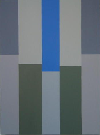
 Middle Blue, 2005, oil on canvas, 76 x 55 inches
Out of all the paintings in the show Middle Blue is the winner. This painting is very reminiscent of Matisse while at the same time bringing faint images of cathedrals with their majestic stained glass windows. Lipsky has spent a lot of time studying the stained glass windows in France, reason why Blue became a major color in her work. After coming back from one of her trips she got on the phone with Kremer Pigments and demanded the company to start carrying a certain shade of Cobalt Blue. Middle Blue is an exception to her use of Blue because in this painting the Blue has greenish undertones. This slight difference in hue may not be noticeable to the new viewer but to one who has studied her work for a few years the slight change is enough to be seen. The biggest thing that blew me away is the most insignificant detail in the painting. When I walked into the room and saw the painting I immediately saw the red outlines in surrounding some of the bars. I thought, "she did it again" because some of her best works shows her process of getting to a specific color. In Middle Blue she has left these Red areas from underlying paint layers she decided not to fully cover. Once again, edges in Lipsky's work are important.
 Homage to Bellini, 2005, oil on canvas, 81 3/4 x 62 inches
Another factor that makes Lipsky's painting significant is her connection to the past. As modern as her work might seem the formal elements of good ol' oil painting is still there. The artist is always keeping in mind the many centuries of art that has come before her, allowing her work to be compared with the standards of Renaissance art and other movements. This is obvious in Homage to Bellini, where the artists has taken color hints from the master. As I stood in the gallery I over heard her say to some one that Middle Blue was also taken from another Renaissance master, Lorenzo Lotto.
 Proust's Sea, 2006, oil on canvas, 81 3/4 x 62 3/8 inches
Not all of Lipsky's work has reference to art history, some of it deals with literature. In the case of Proust's Sea, she has taken the title after developing some connection between the painting and, according to David Cohen, in Proust's Swan's Way "when the narrator, in different Balbec hotel rooms, sees the sea...low, glazed bookcases reflect a frieze of seascapes."
Not Too Well Daddy, 2005, oil on canvas, 70 x 47 inches (on left) Odalisque, 2005, oil on canvas, 69 1/2 x 47 inches (on right)
The main focus in Lipsky's recent body of work is the deliverance of sophisticated color. In these paintings the artist has pushed herself further exploring new hues and combinations that are charting a new territory for her future work. In the past her use of color was strong, vibrant and multi layered. Now, the paintings are more quiet, wise and some what more private but with an undeniable presence. 


Comments