This is it, the last painting of 2012, a good close to a great year! I began work on this portrait of Jarod in August 2011, and although the composition is simple, the execution needed to be just right. I spent a lot of time developing the flesh tones trying to get a variety of warms and cools, I think I found myself glazing a lot more than I ever have. Trying to get the likeness of Jarod's face was another reason for the many layers on his face. Perhaps the nose and lips challenged me most, but these are all just the beginning elements of a good portrait. The hardest thing to achieve for any painter is capturing the soul of the sitter, lucky for me I know Jarod very well, this made it easy for me to connect with the painting from the start.
What drew me to this pose was how the turtleneck, with it's volume, framed Jarod's face. It reminded me of 17th century Spanish court paintings of regal men of high stature, business men who had a cool and important presence. Jarod is one of those few regal men left in this day and age, always manages to look well put together, and believe it or not he came close to getting rid of this turtleneck. I stopped him of course, and now he wears it often during winter. Aren't you glad Jarod I stopped you from committing fashion suicide?
Monday, December 31, 2012
Friday, December 28, 2012
Window Air
Winter Morning, Connecticut, 2012, oil on linen, 9 x 12 inches
Not quite plein air, not quite studio paintings, these babies were executed looking out of the windows of my parents' home in CT. Window Air, that's what I'm calling them, haven't you heard? It's the newest art movement sweeping the land, tell your friend, call your mom, scream it at loud, it's here, it's queer....alright I may have gotten a little carried away!
Early Afternoon, Winter, 2012, oil on linen, 12 x 9 inches
All jokes aside, I was not planning on doing any painting at my parents' during Christmas break, but sometimes impulse takes over and I have no other choice but to give in. Out came the brushes and the paint box and before I could brush my teeth, or shower even, I sat in front of the window of my old room and began working on the cloudy sky above. As the warm blooded latin man that I am I hate being exposed to the cold, after twenty two years of living in New England I still can't get used the winters here! Sometimes I wish I could hop in a plane headed for Miami and never come back. I've learned how to deal with it though, and while painting these sketches I managed to stay nice and cozy. I just came to realize that the two windows I chose to paint out from had heat radiators right under them, go figure! I do try to push myself as much as I can, and this winter I'm hoping to do some actual winter plein air painting. Actually I have a trip to Colorado planned at the end of January where I will be painting the beautiful sites of wintery Durango. Wish me luck and pray I don't turn into a big icicle...more to come.
Labels:
clouds,
Connecticut,
Hartford,
landscape,
painting,
plein air painting,
trees,
winter
Location:
Hartford, CT, USA
Wednesday, November 14, 2012
Clementines, 2012, watercolor on paper, 6 3/4 x 10 inches
While visiting my parents in Connecticut this past weekend I kept myself busy by doing a little watercolor. I am determined to get better in this medium, I feel like I need to practice a lot before my Italy workshop next summer. I will be doing some plein air watercolors in the Tuscan landscape, and I want to prepare myself so that I can accomplish a nice set of studies. In the meantime these little "cuties" will do!
Labels:
clementines,
still life,
watercolor,
works on paper
Sunday, October 28, 2012
Watercolors from St Maarten
Ilet Pinel, 2012, watercolor on paper, 6 3/4 x 10 inches
While sitting in the beach of Orient Bay in St Maarten working on these watercolors, little did I know that after landing in the States I would have to get ready for a hurricane! That kind of weather is common in the Caribbean, but not here in New York, which makes this situation funny to think about since the storm was brewing not too far north from us on a neighboring island. As "Frankenstorm" was taking shape in Jamaica, I was enjoying the sun and water of the "friendly island."
Cayes Verte, 2012, watercolor on paper, 6 3/4 x 10 inches
I really wanted to take my oil paints with me, but that also meant that I needed to travel with my field easel and a number of canvases; somehow that idea didn't sound practical. Not to mention that there might have been a risk of my paints getting taken away by airport security. Plan B was to take two watercolor sets and sketchbook, which I wasn't so excited about, but a few watercolors and days later I think I made the right choice
Orient Bay, 2012, watercolor on paper, 6 3/4 x 10 inches
I have never considered myself a watercolor painter, I have always shied away from it because I have never been able to control the medium. I've always had runny incidents, and the idea of doing plein air watercolors intimidated me! I'm always up for a challenge though, and so I forged ahead and after my first watercolor I was hooked!
Cupecoy Beach Cliff, 2012, watercolor on paper, 6 3/4 x 10 inches
I became so excited about watercolor that I wanted to pop out my sets every chance I could get. The top three landscapes were done in the beach where my resort was located, a place called Orient Bay, a place the locals recognize as having the most beautiful beaches. In my opinion all of St Maarten has beautiful beaches, it is a place surrounded by crystal clear, turquoise blue water, it was truly heaven on earth. Orient Bay beaches may be beautiful but nothing compared to Yellow Beach, on the little Pinel Island, which can be seen across the bay on the second watercolor above. That place was peaceful, and there were no waves, which made it feel like I was swimming in a shallow blue lagoon.In the photo above I'm at work aboard the sail boat Passaat, and as you can see in the background, I am not lying about the color of the water! The Passaat anchored right off Cupecoy Beach and the cliff across the water was begging to be painted. Of course it had to wait a bit for me to be done with my swim around the about, which provided snorkeling gear to get close to the schools of fish swimming around.
In all, my trip to St Maarten was a great experience that not only allowed me to get acquainted with another culture, but also allowed me to shed my fear of watercolor painting.
Labels:
landscape,
plein air painting,
seascape,
St Maarten,
travel,
watercolor,
works on paper
Location:
Avenue des Plages, St Martin
Saturday, September 22, 2012
Drawings from the Met
Detail from Saints Peter and Paul after Jusepe de Ribera, 2012, ball point pen in moleskine sketchbook
Weather if it is painting in the studio or plein air, there's nothing else I enjoy more than to visit the Met and spend time drawing from the works on display. This set of drawings is from my last visit a couple of weeks ago, as always I have fun doing these while doing a little bit of learning at the same time.
Portrait of a Man (The Auctioneer) after Follower of Rembrandt, 2012, ball point pen in moleskine sketchbook
Detail from Samson Captured by the Philistines after Guercino, 2012, ball point pen in moleskine sketchbook
Detail from Atalanta and Meleager after Peter Paul Rubens, 2012, ball point pen in moleskine sketchbook
Labels:
drawing,
Met Museum,
moleskine,
sketchbook
Monday, September 17, 2012
New Painting: Oak Tree, Rhinebeck
Oak Tree, Rhinebeck, 2012, oil on linen, 12 x 18 inches
Hot out of the oven and right on to the display case...that comment really makes me wish I knew how to make bread, but in this case we're talking about this new landscape painting. The oak tree is not any random tree, it happens to be located in the grounds of the Vanderbilt Mansion in Rhinebeck, New York...can you say "fancy tree!"? I looked through my photo archives, and I have many reference photos, and painting this tree happened naturally. When I was there in 2010 I was taken with the lushness of the tree and the way the sun was hitting certain areas on the top and creating interesting shadows on the ground. I took a few shots and always had them in mind, but it wasn't until I got a hold of an odd sized linen that everything fell into place. The proportion was perfect for the way I wanted to paint the tree, and not before long I was off to a great start. I approached this painting in a similar way to Goodwin, using almost the same palette and alternating between glazes and thicker paint applications. The only difference is that there are more warm light tones in this. Unfortunately the natural light in my studio and the camera didn't help to show the subtleties in the painting, especially in the dark areas, which are not as dark as they appear in this photo. In the next few days I'll try to take a better photo, for the moment this will do.
Labels:
landscape,
Limon Padado,
New York,
Oak Tree Rhinebeck,
painting,
Rhinebeck,
trees
Friday, September 14, 2012
New Plein Air: Mom's Patio
Mom's Patio, Connecticut, 2012, oil on linen, 12 x 9 inches
I made a quick one day trip to Connecticut yesterday to be there for the birth of my first niece. Yes I'm an uncle to a healthy baby girl! I didn't have much time to explore areas near my parents' home for some plein air painting, so I set up shop in their back yard and painted my mother's sitting area, tucked away in a little corner in the back of the house. I needed to work quickly and more painterly...I'm still not sure how I feel about it but I do like the sense of light and shadows that made it to the painting. More to come.
Labels:
cityscape,
Connecticut,
Hartford,
landscape,
painting,
patio,
plein air painting,
summer,
trees
Location:
Hartford, CT, USA
Monday, September 10, 2012
New Plein Air: Cherry Hill Fountain
Cherry Hill Fountain, 2012, oil on linen, 9 x 12 inches
I went out to Central Park on Friday, it was unplanned and I think it worked out for the best. It was a hot humid day, but I didn't mind, it seemed like it was the right day and time to be there. In this painting I revisited a subject I attempted to paint on my second plein air ever back in 2009. Back then I was happy with it, but as the years go by I dislike it more and more. This is the first take of San Remo of 2009, compared to the painting I did this weekend I say there have been some major changes happening! In the next few weeks temperatures will start to cool making it more pleasant to paint outdoors.
Labels:
Central Park,
cityscape,
landscape,
New York,
painting,
plein air painting
Tuesday, September 04, 2012
New Plein Air: Brick Cafe
Labels:
astoria,
buildings,
cityscape,
New York,
painting,
plein air painting,
restaurant
Location:
Astoria, Queens, NY, USA
Monday, August 13, 2012
Seeking Inspiration
View of La Crescenza, Claude Lorrain, Metropolitan Museum of Art, New York
As I have said it before, there are times when I become creatively dry, it seems to happen often, at least once a year I go weeks without being able to work. When I seem to hit the lowest point I can always count on the Metropolitan Museum of Art, my sanctuary, to pick me up. There are so many beautiful objects and paintings in this museum that it's always impossible to pick one or two favorite pieces, but guaranteed something or a number of them will catch your eye. The painting above did just that. It's not my first time seeing it, but this weekend it graved my attention longer than usual. Perhaps is that ideal afternoon light, a warmth that engulfs the landscape. Can you imagine living in such place? Well someone did, as the wall plaque states "the country house, which still stands, belonged in the seventeenth century to the Crescenzi family." I wonder if this humble country house is for sale?
Via Crucis, Juan de Valdes Leal, Hispanic Society of America, New York
Another painting that graved my attention was Juan de Valdes Leal's Via Crucis. After visiting the Met regularly over a period of eight years one gets closely acquainted with the collection and the rooms they usually hang in. This is a painting I've never seen on display, I thought thank god they brought something out from storage. As I approached the wall plaque to find out more about the piece it turns out that it is currently on loan by the Hispanic Society of America due to a collaboration with the Met to restore the painting.
Saints Peter and Paul, Jusepe de Ribera, Metropolitan Museum of Art, New York
Moving along through to the next gallery another beautiful painting cought my eye. This one by Jusepe de Ribera, one of my favorite painters, and this specific painting is from early in his career when he was deeply influenced by Caravaggio's style. One of my biggest art history heroes is Caravaggio, reason why seeing this painting was a special treat. I stood in front of it for a while as I sketched the head of Saint Paul, the figure on the right side of the picture. Again, thank you Met curators for bringing out this gem from storage!
The Madonna and Child with Saints Anne and the Infant John the Baptist, Mirabello Cavalori, Metropolitan Museum of Art, New York
The goodies kept on coming as I saw more "new" work on display. At first glance I thought this was an Andrea del Sarto painting, the style, coloring and treatment of the paint are very reminiscent of his work, but I was wrong. This painting is by the hand of Mirabello Cavalori, which the Met described as being "one of the gifted young artists who worked for the Medici Grand Duke Francesco I in the early 1570's. His paintings are rare and its is an occasion that three are currently on view" in the same gallery.
Midas Washing at the Source of the Pactolus, Bartolomeo Manfredi, Metropolitan Museum of Art, New York
Maybe I picked the right day, maybe I'm just lucky, or maybe both, but I came across another beautiful painting that hasn't been on display at the Met, at least not in the many times I've visited. This Manfredi painting is one of the best examples of the Caravaggisti school. I love the close range of earth tones, the dark moody background that Midas emerges from, and the dramatic light effects, but what I love most about this painting is the X composition made up mostly of diagonal lines that run from the figure's right shoulder all the way down through the left leg, and from the top of the head straight through the right hand onto the right leg covered by a deep sienna drape. This is what I call delicate and moving simplicity, something Caravaggio was a true master of. As it is suggested, Manfredi was not only a follower of Caravaggio, but he me have been an apprentice to the master. Now that's a lucky guy!
Atalanta and Meleager, Peter Paul Rubens, Metropolitan Museum of Art, New York
As if my visit couldn't get any better, I came across this gorgeous Rubens painting depicting a story from Ovid's Metamorphosis. I have always admired the monumentality and the vivid flesh of Rubens' figures, as they move with grand gestures throughout his compositions. This guy could paint there is no doubt, and this large panel painting serves as one more testament to that fact. I sketched Meleager's head as I paid close attention to the different colors used in the flesh. I don't think I did a good job with the sketch, but I don't feel so bad since it's Rubens I was trying to copy from! That sketch and some others done that night will be posted on here during the week. Stay tuned.
Wednesday, August 08, 2012
New Plein Air: WTC Under Construction
Labels:
buildings,
cityscape,
New York,
painting,
plein air painting,
World Trade Center
Location:
Hudson River Park, New York, NY, USA
Friday, July 06, 2012
Color Studies
Color Study: Mexico, 2012, watercolor on paper, 7 3/8 x 9 inches
It has been a while since I've tried to do anything abstract or painterly. There are times when the urge for working on large canvases becomes overwhelming, an urge I can't give into because space is very limited in my small studio. My only choice is to do small color studies on paper, this allows me to release the urge without compromising space. The following color studies were done one late night when I had the craving of pushing color around without worrying about it looking like anything specific. These studies start out with color, shape, movement, and immediacy, but soon things start to connect, and on this night it seemed like everything I was laying down on the paper made me think of specific places I had traveled to in the last year. It's always surprising how certain colors can take you back to certain experiences from any point in life. I hope you enjoy this abstract journey!
Color Study: Stormy Riviera Maya, 2012, iron gall ink and watercolor on paper, 7 1/4 x 9 inches
Color Study: Madrid at Night, 2012, iron gall ink and watercolor on paper, 7 1/4 x 9 inches
Color Study: Madrid, 2012, watercolor on paper, 7 1/4 x 9 inches
Color Study: Sunset, 2012, pastel on paper, 8 1/2 x 11 inches
Labels:
abstraction,
watercolor,
works on paper
Monday, July 02, 2012
New Plein Air: Henry Hudson Bridge
Henry Hudson Bridge, Low Tide, 2012, oil on linen, 9 x 11 inches
This is my most recent plein air of the season, about 90% done on site on Friday early afternoon and finished in the studio yesterday. It was a really hot day, the kind of heat that makes you sweat bullets for no reason, even when you're in the shade. On that day my friend Andrea an I went to Inwood Hill Park on the northern tip of Manahattan, a place we've never explored but had wanted to for a while. We didn't realize the park is big and that there are some trails that lead you up some big hills. We hiked up to the highest point, which offers a nice panoramic view of the the Hudson River and the Washington Bridge. I wanted to paint up there but we would have fried in the open sun. We made our way down and walked around for a bit and decided to paint the Henry Hudson Bridge, which was my only reason for going there in the first place. The hardest thing about this day was not the heat or humidity, it was the exposed river bed which proved to be a difficult thing for the both of us to paint. Understanding the color appeared to be easy, when looking at it directly it seemed like a muddy ochre, but perspective and reflecting light changed the color in many areas. There was blue, green, ochre, grey, brown, and God knows what other colors. I kept thinking of Corot's two paintings, Rome-Island Bridge of San Bartlomeo, and Narni: The Ponte Augusto Over the Nera. Not that I was trying to be Corot, let's face it, that's a tall order to fill! I kept asking myself though, how would Corot do it? Especially on the latter painting where he depicts a muddy like river with blue highlights, very similar to the one I had in front of me. It took a while for me to get it to the point where I was satisfied enough before calling it quits, and this is what I have to show. More paintings to come.
Labels:
cityscape,
Henry Hudson Bridge,
landscape,
New York,
painting,
plein air painting
Tuesday, June 19, 2012
New Plein Air: Bulkeley Bridge
I had nice Father's Day weekend in Connecticut, spent most of the time there with family and friends, but as always, I have to make some time for painting. It turned out to be a beautiful hot weekend, I thought painting by the water might not be a bad idea. I found a spot by the boathouse in Riverside Park in the north end of Hartford. This park has been restored, providing Hartford residents a boat launching area, a rowing facility, fishing access, football field, cricket field, beach volleyball court, bike and nature trails. This restoration is part of a big project to beautify the downtown area, a large task that has been going on for a number of years. I think Hartford is a nice town, but unfortunately it has become the little sister that never grew up, stuck right in the middle of the two older and bigger sisters, Boston and New York!
Bulkeley Bridge, Connecticut River, 2012, oil on linen, 8 1/2 x 11 inches
It's been a while since my last plein air, I felt a little rusty at first, so much so that I almost gave up. I was getting very hot, there was no shade near by, but I fought on and I'm happy with the outcome. Maybe not the best plein air but I'm happy with it.
Labels:
bridge,
Bulkeley Bridge,
cityscape,
Connecticut,
Hartford,
landscape,
painting,
plein air painting,
summer
Wednesday, June 13, 2012
Sap Green Test
A little down time at the shop causes us to test a lot of paint; today was one of those days. I was looking at some Holbein paint swatches earlier and I almost bought four different greens, not that I needed them since I have a ton of greens at home by Williamsburg, Old Holland, and Graham. To justify my probable spending I decided to compare Sap Green, a color find very useful in my landscape paintings. To be honest I don't know what I would do without it. I have been using Old Holland's Sap Green and I find it beautiful, there is not other like it. Unfortunately Old Holland's prices keep soaring each year, this made me find an alternative, and through some small tests I found Graham's Sap Green to be most similar to O.H.
Today's test will be between Holbein, which I had been eying all day, and Graham. Since I already own a large tube of by Graham I needed to know if Holbein's would be worth the purchase. I was expecting a different shade, but to my surprise they are both the same hue. Both brands are a mixture of Phthalo Green and Azo Green, but Graham also contains Ivory Black.
I squeezed out the same amount of paint on to a glass palette, the first noticeable difference is that Graham's paint is loose and wet, Holbein's stiff. I took a small amount of Titanium White and mixed it with Graham's Sap Green. I was amazed at the intensity of this paint, it always gets me! I mixed the the same amount of white with Holbein's and there was no punch at all. I had to mix more green to get it close to Graham's paint. Even after using up all the Holbein paint I had laid out on the palette it still didn't equal to the intensity of Graham. This means I have to stick with the large tube I already own, no new paint for me today.
I think it's good for artists to be inquisitive and run tests of the materials they are using, surprises, good and bad, can come out of these random yet significant samplings.
To the paint makers, I am not knocking your product down if I don't find it to be exceptional, you know what you put out and it's my right as a consumer to compare and contrast all brands and to voice my opinion.
Monday, June 04, 2012
Landscape Sketches
Somehow for a year I stopped drawing and developing ideas in my moleskine sketchbook. I carry it with me everywhere everyday but somehow it's been untouched since last June! That changed a couple of weeks ago when an unexpected trip to Central Park after work in a beautiful sunny afternoon brought me face to face with a little vignette of the Beresford in Central Park West. That afternoon I discovered a nice little spot by Turtle Pond, and across the water this building stood tall dominating the skyline. Who can resist?
Inspiration struck again last week while visiting Colorado. Funny thing is that the last three drawings in my sketchbook were landscapes sketched in Colorado a year ago, and now that same state and it's vast land caused me draw some more.
These three sketches were drawn in a moving car while going from place to place. I approached these as a fun exercise, it required me to see something in a few seconds, take a metal picture, and at the same time lay down some quick gestures of the main planes and elements of the landscape. From there I developed the drawing from memory, which is a nice change.
I'm planning on turning all of these drawings into bigger oil paintings. The next step is to take these sketches and make some oil sketches to determine the values and to further develop the details of the composition.
Labels:
drawing,
landscape,
moleskine,
sketchbook
Thursday, May 17, 2012
New Painting: Goodwin
"Goodwin" 2011-12, oil on linen, 22 x 28 inches
Here it is, fresh off the easel, a landscape I've been working on since last year. This is Goodwin Park in the south end of Hartford, a short five to ten minute walk from my parent's house. I have lots of memories of this park and of this path, I can still see myself riding my bike through here! Hope you enjoy this one, now I'm moving on to the next painting.
Labels:
Connecticut,
Goodwin,
landscape,
painting
Friday, April 27, 2012
New Website Live
I am very happy to inform you that my new website is live, is up, is running, is set, is done and done...you get my drift! I don't know what took me so long to update it, but better late than never right? Check it out and tell me what you think. www.luiscolan.com
Sunday, April 22, 2012
Why Beauty Matters
I came across this video on another blog, it was actually the Peruvian Figurative Society, a group of Peruvian painters who focus on contemporary realism. To my surprise this video is in English, and for close to an hour I sat in my studio watching and feeling inspired and moved. We live in a society that values the ugly, fast, and cheap. We have lost ourselves and beauty has become a taboo subject, at least in art. This video will show you that beauty is a human need and that it hasn't been lost, we have just closed our eyes to it. I hope you enjoy it.
Labels:
Art History,
film,
information,
inspiration,
video
Friday, April 20, 2012
Grisaille of Jarod
I finished working on the grisalle, or underpainting of Jarod's new portrait. So far so good, the scary part will be adding color which at first always tends to look a bit messy. I'm hopping to achieve dramatic chiaroscuro with this painting, something a bit like Caravaggio, not that I'm close to his amazing genius, but you never get anywhere without trying. Cross your fingers for me and lets hope I get through this painting with flying colors, no pun intended.
Labels:
figure,
grisaille,
Jarod,
Jarod Asleep,
portrait,
process,
underpainting
Friday, April 13, 2012
Four Burners Going at Once


Wednesday, April 04, 2012
New Plein Air: Triborough Bridge
Triborough Bridge, 2012, oil on linen, 9 x 16 inches
Recently the weather became warm, and in one of those days when temperatures reached the high sixties I took myself out of the studio for the first plein air session of the year. Too bad that with this crazy weather consistency is too much to ask for, a day after I started this painting temperatures dropped bringing us back to winter. Now what's that all about mother nature? Since I don't do so well in the cold I was forced to finish the details of this painting in the studio.
The Triborough Bridge has been a big part of my life while living in NYC. It is through this bridge that I have driven through many times to get to my parents' home in Connecticut. This is also same bridge that stands tall above the running track in Astoria Park, where I go for a run a few times a week in the summer. This bridge has always been looming above me, there was even a time when my apartment was located near the foot of the bridge, everyday I would walk by it to and from work as it rose majestically above buildings and trees. It was only natural that at some point I would paint it as it extends over the East River, connecting Astoria, Manhattan and the Bronx.
Labels:
cityscape,
landscape,
New York,
plein air painting,
Triborough Bridge
Friday, March 16, 2012
Jeffrey Reed
There are times when as you go through your journey as painter other painters come into your periphery, some may awaken a light interest, some may inspire, some may even spark the flame of competition, and in the case of Jeffrey Reed they leave a deep impression. I've never heard of Jeffrey Reed, that's until today while doing my usual internet research in the art community around me. Mr. Reed doesn't seem to have a website for his work, at least none that pulled up by google, but I did find this video and it was enough to get me acquainted with the man and his work. I'll let this video and his paintings do the talking, enjoy and keep seeing the beauty of this world!
"I'm not locked into a certain palette. I usually set up in front of a subject and ask myself how many colors can I get away with, meaning how few colors can I use to capture what's in front of me?"
Jeffrey Reed
Labels:
Jeffrey Reed,
landscape,
video
Monday, March 05, 2012
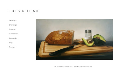
New Painting: Avocado Sandwich
Avocado Sandwich, 2012, oil on linen, 14 x 26 inches
This is the first painting of the year, I didn't realize it would take two months to complete, but I'm glad to say that I'm done and I can move on to other projects. The format of this painting is different than what I'm used to working with, I think I'm starting to like painting on more horizontal shaped canvases. This painting was a mixture of fun sessions and frustrating nights, but I kept plowing through and I'm very happy with the outcome. Avocado Sandwich (detail), 2012, oil on linen, 14 x 26 inches
This is a detail shop of the painting, there are a number of subtle color shifts in the background and in the objects depicted, it's too bad that they seem to have been lost in the photographs.I'm not sure what's next, I wanted to start a larger still life but I think that might have to wait since I have three other paintings I started last year that still need work. More to come.
Labels:
Avocado Sandwich,
painting,
still life
Thursday, February 23, 2012
Not Slaking, Just Concentrating
Labels:
Avocado Sandwich,
process,
still life
Saturday, January 21, 2012
Problem Fixed...I Can Breath

On the Pan, oil on panel, 2009-2011, 24 x 20 inches
Labels:
On the Pan,
process,
studio,
varnish
Subscribe to:
Posts (Atom)