
Art (212)
 Come on in to the show!
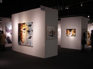 Yesterday I checked out Art (212) Contemporary Art Fair held from September 28 - October 1, 2006 at the 69th Regiment Armory in Lexington Ave at 26th Street. I'm exhausted since on Saturday I went to the Met to see Sean Scully: Wall of Light show. More on that later! So what does (212) stand for anyway? This is the telephone area code of New York City, Manhattan to be more exact. A couple of months ago I missed a similar art fair, The Armory Show and I kicked myself for it. I was very close to not going to this fair but at the last minute I took the subway ride on the 6 to the venue. No excuses this time since I had a $5 discount off the general admission price of $15. This fair featured 60 leading international galleries representing contemporary emerging and mid-career artist.
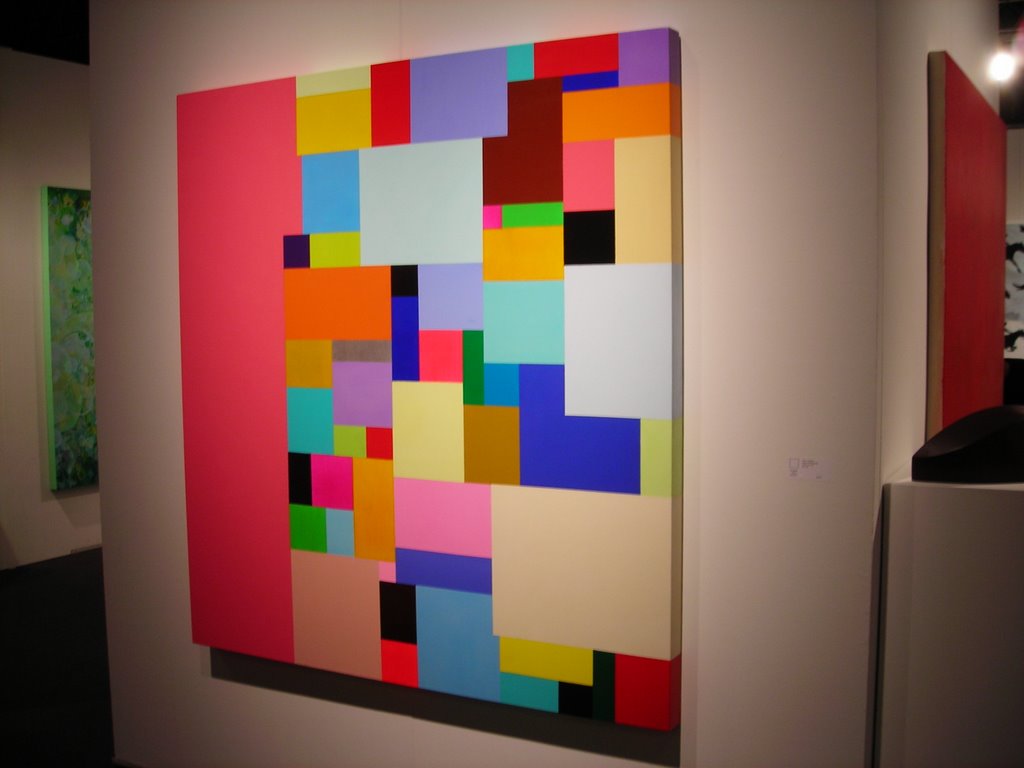 Being the jaded boy that I am, I was expecting crappy art. You know, the flashy, shocking crap that I see all over contemporary art publications. OK, I did see some of that stuff yesterday, but to my surprise and enjoyment there was a lot of good art. At the front of the pavilion I saw this geometric abstract painting which reminded me of Hans Hofmann. I'm a sucker for color abstraction, especially if it's a grid painting. I did not write down the name of the artist or gallery it was in, but I do remember that it's an acrylic painting. I hate using acrylic but it's nice to see others work successfully in this medium. The composition of this piece worked for me because of the different sizes of the squares and rectangles, thus creating a wonderful rhythm. Not to mention the festive color choice, which was the reason why it stopped me on my tracks.

Stuart Arends, Stanza Dell' Amore 6, 2004, oil and wax on wood, 7.25 x 5.5 x 2.75 inches
Like I said, a sucker for the grid, and when I saw this painting I could not believe how much it looked like my teacher Pat Lipsky's recent work. I was enamored with this tiny abstract painting and the colors made me feel good. I wanted to take it from the wall and make a run for it, since I didn't have the $6,000 asking price! But I decided to just take a picture of it. Stuart Arends is represented by Richard Levy Gallery, Albuquerque, NM. I love the subtlety between the white on top against the off white at the bottom.
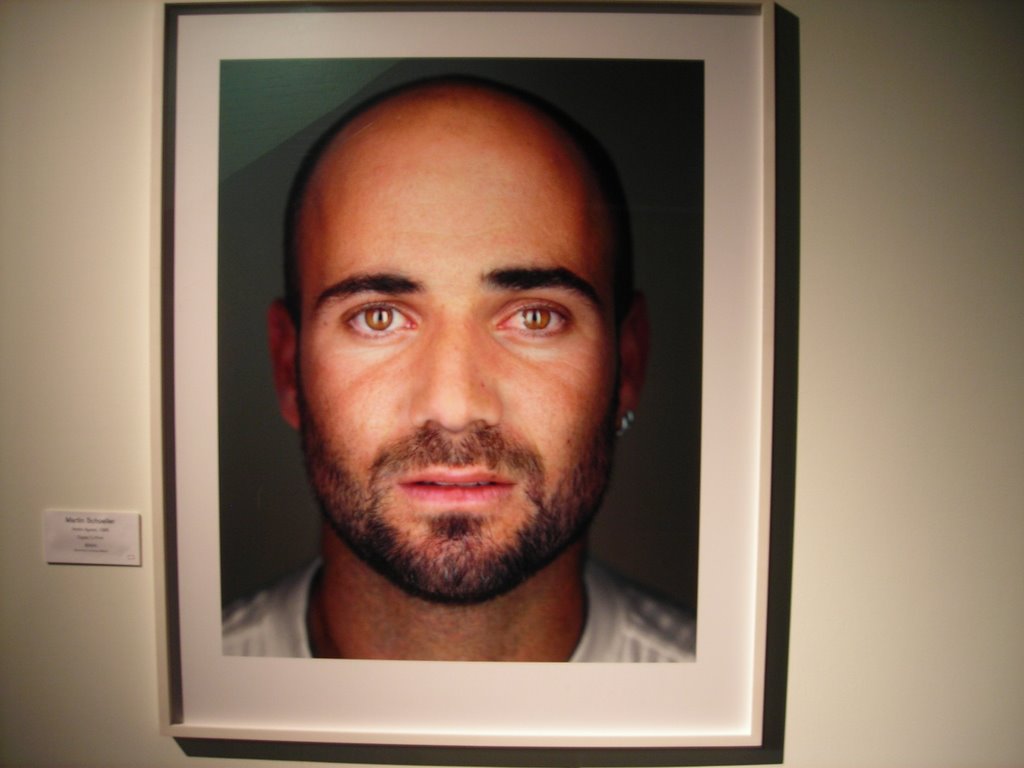 Martin Schoeller, Andre Agassi, 1998, chromogenic print, 30 x 40 inches, ed 7
I saw this photo of the famous tennis player and I thought it was cool. Aside from painting, I have an interest for photography and the lighting reflecting on Agassi's eyes and face was beautiful. Martin Schoeller is represented by Hasted Hunt Gallery, New York, NY.
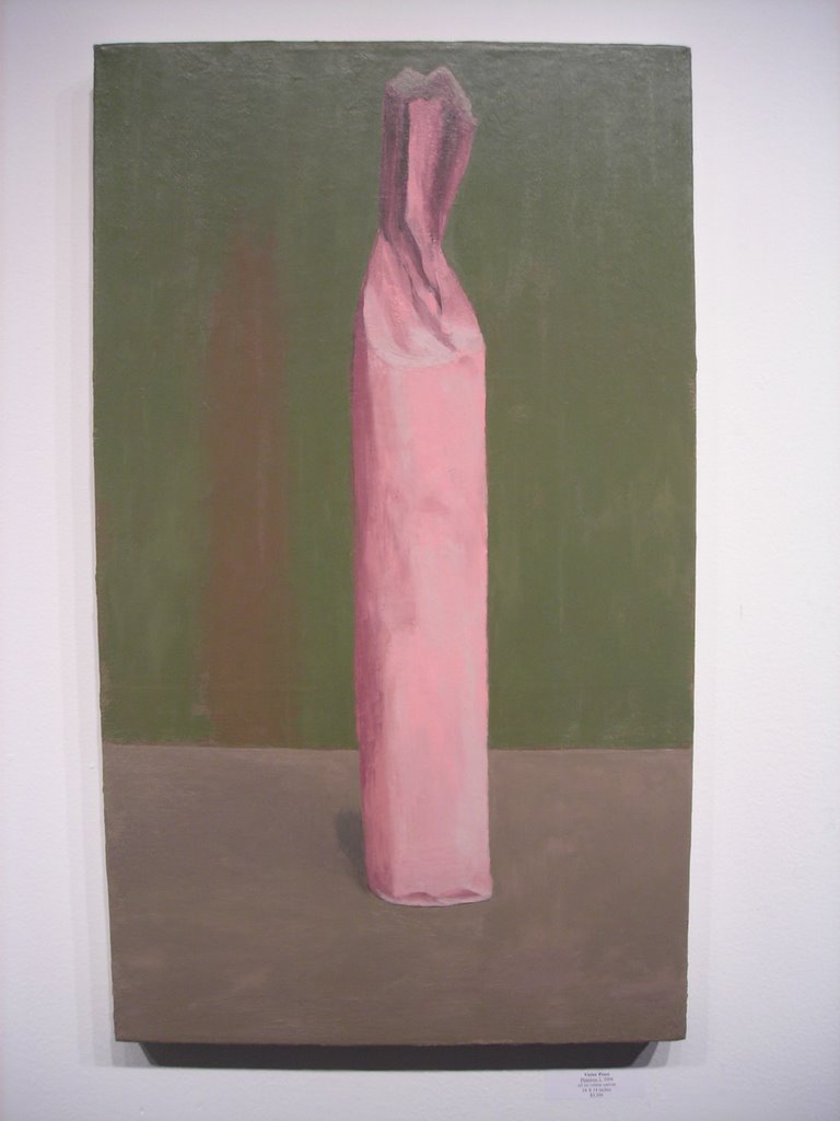 Victor Pesce, Phantom 2, 2004, oil on canvas, 24 x 14 inches
I became familiar with Pesce's work a couple of years ago while looking online through the artists roster of the Elizabeth Harris Gallery. I immediately was drawn to his work due to his amazing use of color. The man can do bright color as well as very sensitive soft grays. Pesce works in a style I like to call Minimalist Representation, using bottles, cups, boxes,and pans as subjects but only suggesting their shape and mass without revealing their true textural nature. This was my first time seeing his work in person and as I looked at the paintings on show I could not help but to think of Morandi. I could not help but to notice Peter Hoffre's landscapes. I was not sure what they were about. From far they looked like painted on glass but come to find out they were oil on wood topped with resin. This guy knows how to combine tradition with contemporary approaches. His touch was very painterly and his soft glowing lights were reminiscent of Venetian painting. This Canadian painter is represented by Kathryn Markel Fine Arts, New York, NY.
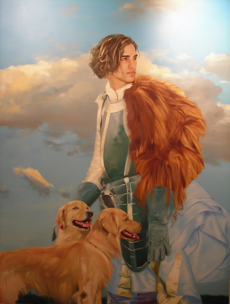 Daryoush Asgar, Easy to Reach, 2006, oil on canvas, 87 x 67 inches
Here I come to the end of showing some of the work of Art (212). These two paintings are by artist Daryoush Asgar who has portrayed young men in heroic poses. Although these paintings have a very contemporary edge, similar to billboards and fashion ads, they still hold on to the European tradition of oil paint on canvas. Easy to Reach reminded me of portraits by Anthony Van Dyck, while the young man in On Top brought to mind Caravaggio's Bacchus. The handling of the paint on these large canvases was impeccable, the use of color clean, and the homoerotic presence of the figures made the work stand out. This artist is represented by Ernst Hilger Gallery, Vienna, Austria.
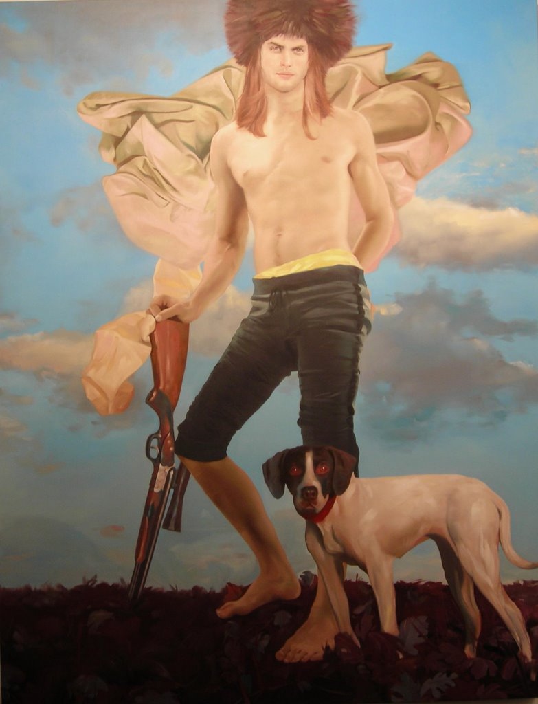 Daryoush Asgar, On Top, 2006, oil on canvas, 87 x 67 inches
For more images from Art (212) please visit flickr and look at the set I made for this fair.


Comments
Luis