
Workbook Pages 2
In July I introduced my Workbook pages, a sketchbook devoted to abstract ink paintings. This project is still underway but because I have been more focused on the still lifes, work on this sketchbook has slowed down. The idea of the Workbook is to keep me active in the creation of abstract work, a visual language I hope to go back to soon. Different than a sketchbook, where ideas are jotted or sketched quickly to capture the essence of an idea, the Workbook functions as a series of more resolved images. In this workbook I am able to keep the spontaneity of a sketchbook but the presentation of it is more refined. The paintings are created with the idea that they could be hung on a wall and read as a finished product.
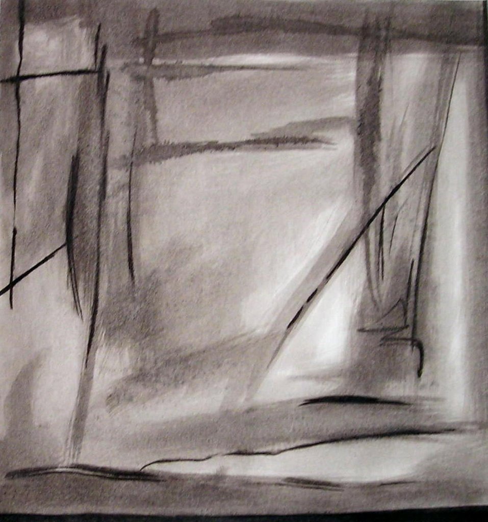 Fog, 2005, Kremer Shellac Ink on paper, 9.5 x 9 inches (image), 11 x 11 inches (paper)
In Fog I'm starting to explore further the use of line and atmosphere. My larger abstractions were headed on this direction just before my move to New York. I had completed a painting that dealt with the idea of using lines but in a much different way. My work had been influenced by Mark Rothko, and after working on a series of atmospheric paintings my teacher Stephen Brown suggested I should try to work with "atmospheric lines". I began work on a painting that was very different to what I had done at that point and the process and look of it intrigued me. In the painting above I'm trying to get reacquainted with this new found style in hopes that it moves on to something more complex.
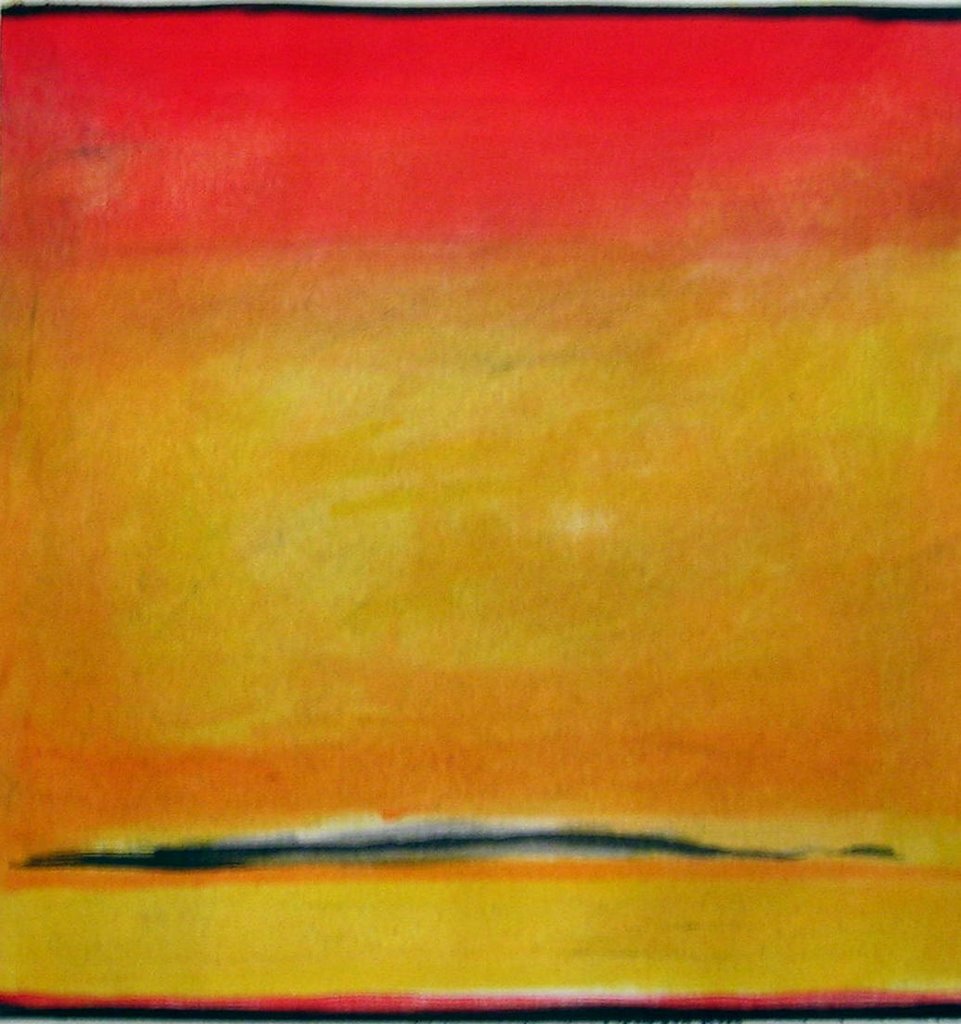 Red Top, 2005, Kremer Shellac Ink on paper, 9.25 x 9 inches (image), 11 x 11 inches (paper)
No matter how hard I try to shed Rothko's influence it still manifests itself, and Red Top is no different. I think this is one of the very few paintings I've done where Rothko's influence is very visible. I was not looking to make something Rothko like when I started this painting, I was more interested in getting familiar with a new medium and scale. I was introduced to Kremer Pigments' Shellac inks and I was very excited to give them a try. Never had I seen inks so rich and full of body. What I enjoy the most about them is that I can layer multiple times without the previous layers reactivating and mixing into the top ones. Its the shellac in the inks that makes them dry water proof allowing me to work for long periods of time.
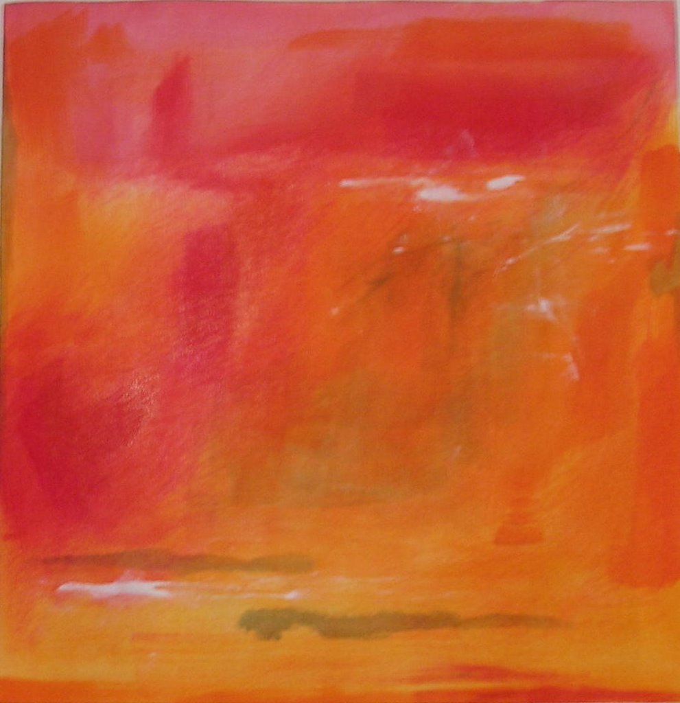 Orange Blast, 2005, Kremer Shellac Ink on paper, 9.25 x 9 inches (image), 11 x 11 inches (paper)
For Red Top the ink application was made up of thin washes, a common use of ink. But on Orange Blast the application becomes heavier. The good thing about Kremer's Shellac Ink is that they are so heavily pigmented that the pigment forms a buttery paste at the bottom of the jar, which you have to stir before using. But what I like about that is that I can take a small palette knife, scoop the color out and apply it just like oil or acrylic onto the paper. On Orange Blast the white specks of color were applied with heavy white ink using the bottom of my brush handle.


Comments
Luis